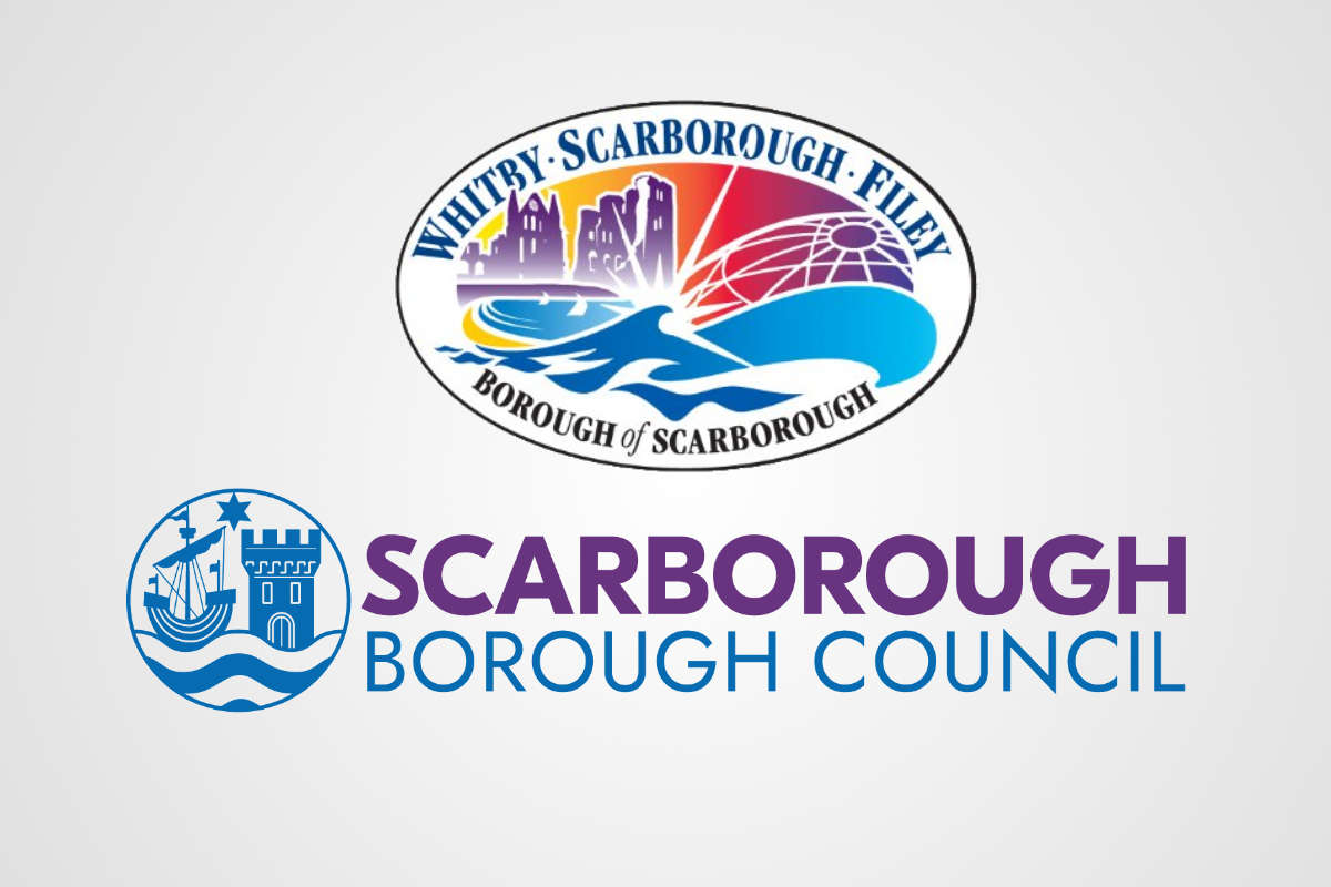
Whitby and Filey Councillors are dismayed that the towns don't feature on the new logo, but the council leader says all is not as it seems.
When is a logo not a logo?
It turns out the answer is..... when it's a place brand.
Scarborough Borough council has recently changed the graphic that appears on it's website and letter heads from an oval design that mentioned Filey and Whitby to a new round design with a ship and a castle but no mention of the the borough's towns.
The change caused some criticism from councillors in Filey and Whitby.
But Council leader Steve Siddons says all is not as it seems.
The new logo has been introduced on Scarborough Borough Councils website and has come in for criticism because it doesn't mention Filey or Whitby.
The authority's leader says the change wasn't meant to offend and that actually the oval was never the official logo in the first place.
A council spokesperson said:
“We introduced a new brand identity for our organisation last summer to ensure residents and businesses are clear about the name of the organisation providing the local services we know they value and appreciate.
“Scarborough Borough Council is our proper name, which is why the logo features it so prominently.
“The circular graphic element of the logo is based on the borough's traditional heraldic crest, which has been in place since the council was originally formed in 1974.“The ‘oval’ borough logo has not changed. It remains as a place brand for the borough of Scarborough and is still visible in many locations.
“This will be the case until any decisions are made relating to the transfer of powers to the new unitary authority for North Yorkshire, which will have its own identity and logo.”


 Former Scarborough Athletic Chairman Expresses Confidence in Ground Issue Resolution
 Esk Valley Community Railway Backs Train Use for Whitby School Pupils
 Concern Over Bridlington Paddling Pool Use
 Scarborough and Whitby MP Raises Concerns Over PIP Changes at Prime Minister's Questions
 Yorkshire Coast Towns Could Get Share of £1.2m Investment
 Scarborough Charity's Future Fears
 Hornsea Lifeboat Member Among London Marathon Runners
 Scarborough Rugby's Cup Progress
 Mixed Results For Yorkshire Coast Cricket Sides
 Scarborough Athletic Miss Out On Top Half Spot
 Whitby Town Savaged By Table Toppers in Final Clash
 Brid Town Beaten By Belper


Comments
Add a comment